Empowering Citizens by Bringing the Government Closer: Reimagining Arizona GTO’s Digital Experience
Introduction
This project aims to showcase the results achieved by the Arizona Government Transformation Office (GTO). We have worked closely with the GTO team to implement a visually refreshing, modern design for the portal. In addition to visual and architectural updates, the new website will leverage Drupal 9 to add new functionality to the website to improve the overall user experience and accessibility.
Business objectives
- Deliver a modern, responsive and accessible website to the citizens of Arizona.
- Increase visibility and transparency of the efforts of the GTO.
- Improve the way the GTO communicates the type of work they do and the outcomes of the work.
- Demonstrate the impacts of the GTO’s work on achieving success in the State.
- Better publicize the culture of Arizona state work and how we utilize AMS so potential employees can be more informed and thus more attracted to the State.
- Make the GTO website a better resource for citizens, state employees, legislators, etc.
Challenges
Our mission was to redesign the GTO website to reflect the values, initiatives, and results. As a directional change for GTO’s web presence, building brand awareness and easy access to the content and services was one of the top challenges for GTO. Establishing and maintaining trust with citizens, sponsors and state agencies is critical for success.
As a result, the Zyxware team had to come up with a minimal website that conveyed GTO’s value proposition & brand identity. Based on this information & various layers of user flows, we resolved the challenges in the new website design.
Technical challenges
- GTO services were scattered around different other services.
- The public doesn’t have any clarity on the services provided by GTO.
- Current website navigation was poor.
- Site accessibility was very poor.
Our Approach
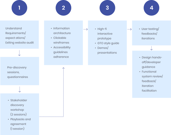
Zyxware approached the revamping with a human-centered design. We designed a new seamless experience that accommodated the need of the platform users and the objectives of GTO without any abrupt shift in their usage patterns. We followed a simple and super agile 4-stage approach to identify, break down, prioritize and transform the needs and objectives into an intuitive and simple-to-use website for GTO.
Our Strategy
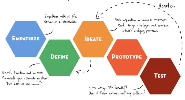
Design Thinking Process
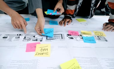
Stakeholder Workshop
The GTO stakeholders were involved and engaged in discovery workshops. This exercise helped ensure that the users’ needs were cared for without a disconnect. We believe that identifying personas was a powerful and versatile technique to get insights & a great way to synthesize user research. We analyzed the competition by researching and gaining knowledge regarding what best suited our project. It helped us build the website that gained visibility among users and met the business objectives and desired future state platform for GTO.
Playback session
In the Playback session, we emphasized the valuable insights and future state vision we captured—validated stakeholders’ sentiments on various use cases by plotting out contextual examples and citations. Most interestingly, in the playback session, we encouraged stakeholders to prioritize the user stories and features using a dot-voting technique. They were super excited and participated with full energy. Hence, the session went well with a bunch of cool features and especially a significant level of mutual consensus—the art of co-creation in all aspects.
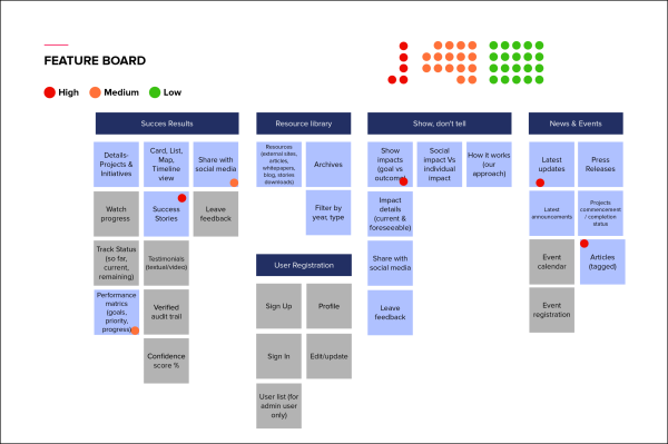
Ideation & Wireframing
We focused on simpler and scalable wireframes to validate quickly and often for us to get early feedback. The early feedbacks are the one that helps us fail faster and continuously do course correction, thereby aligning the expectation vs. outcome. Using Ideation & wireframing phase, we’ve managed to generate as many crazy ideas as possible, engage stakeholders effectively, and show them the art of the possible.
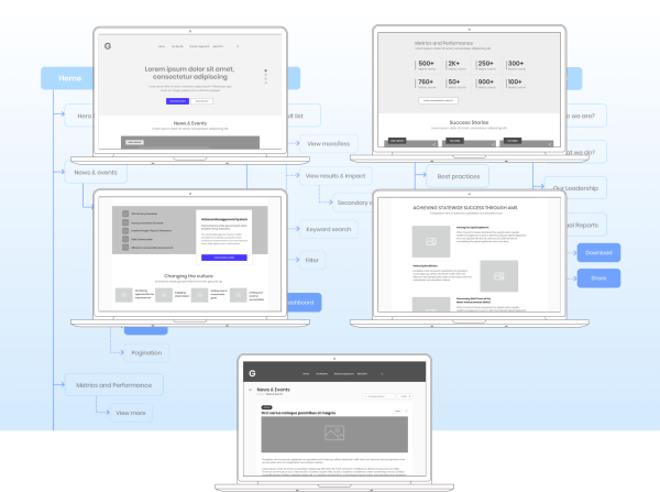
High-fi prototype (web & mobile)
The designs imply the intrinsic values of GTO, purpose, and goal for society. Overall, the visual design is created from a perspective to build trust among users, reduce the drop-off rate and increase revenue and engagement. The website is straightforward, conveys the value proposition offered and helps users, partners, and state agencies navigate quickly and conveniently. We carefully crafted content for each page to build trust and credibility and convince new users to engage with the GTO team. Our UI/UX team designed dynamic yet super responsive screens to convey the benefits and make the platform scalable and simplified to improve the users’ experience.
Result
- A seamless amalgamation of various scattered data and content into one website.
- Simple and improved screen navigation using familiar user patterns and concepts.
- Digital transformation into an easy-to-use content management system.
- Brought up higher visibility to GTO’s initiatives, making results and impact.
- Enable users with seamless website access across various form factors.
Key Takeaways
- We literally experienced and learned the power of co-creation from this project.
- It is essential to collaborate with stakeholders and users to produce ideas.
- Consensus is the best way to make informed user experience decisions from inception to go-to-market life cycle.
Other Takeaways:
- User research plays a vital role in the output of the design.
- Design thinking is such a powerful technique to unveil the user needs and pain points.
- Simple designs and familiar design patterns are the best way to engage users across all the age categories.