How to Create Slider using Slick Carousel?
Slick Carousel
Slick can be used to create a slider. We can create a slider with views and paragraph types or multiple value fields.
Slick carousel has many features. Responsiveness is the main feature, that is the ability to scale according to its container. It provides advanced settings for breakpoints. The slick slider can be scrolled using the auto-scroll, mouse wheel scroll, swipe, desktop mouse dragging, etc. It provides settings for customizing arrow keys and its navigation also provides settings for dots under the slider for slide selecting. Slick has different skins like Full width, Full-screen Split, Grid, and multiple-row carousel.
Installing Slick
Composer Requires Drupal/Slick
For creating a slider with multiple value fields, we need the following modules
- Slick
- Slick UI
For creating a slider with the view, we need the following modules
- Slick
- Slick views
Creating a Slider with Multiple Value Fields or Paragraph Types
Go to extend menu, then install and enable the slick module and slick UI (Provides slick carousel configuration UI).
Now we are going to create a slider with a paragraph type and a multiple value image field.
Steps:
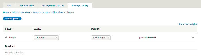
- Now we need to configure slick slider. Click on the settings icon in manage display tab. Set ‘OptionSet’ and ‘Skin’ to any predefined one will generate a basic slider. OptionSet is already selected with ‘default’ OptionSet.
Other Fields and Advanced Configurations
All fields are displayed with a tooltip that contains information about the field. Now we are going to discuss some of the fields.
-
Display Style:
Use either CSS3 Columns or Grid Foundation.
Difference:
- Columns are best with irregular image sizes (scale width, empty height), as it affects the natural order of grid items.
-
Grid is good with regular cropped ones.
Unless required, leave empty to use default formatter or style. CSS3 Columns is best with adaptive height, non-vertical.
Will use the regular carousel as default style if left empty.
-
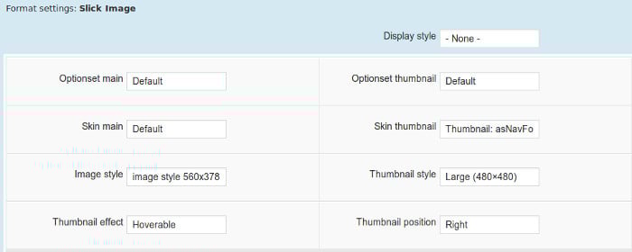
OptionSet Main:
Here we can select an option set which we can create in the slick configuration page. OptionSet is a set of configurations that we can create and save. This increases the re-usability of a certain configuration. ‘Default’ option set is selected as default.
OptionSet creation is going to be discussed in the next topic.
-
Skin Main:
Skins allow various CSS layouts. Slick provides some predefined skins. Selecting OptionSet and a skin is enough to generate a simple slider.
-
Image Style:
Select image style. This is the main image style option. Selecting any image style will help to change the image style like ratio, crop etc.
-
OptionSet Thumbnail:
Select only if we needed thumbnail customisation using optionset.
-
Skin Thumbnail:
Select only if we needed thumbnail for our slider.
-
Thumbnail style, Thumbnail effect, Thumbnail position:
These can be used to specify the thumbnail image style, effect and position. If thumbnail options have been provided then thumbnail for slider images can be displayed as below.

-
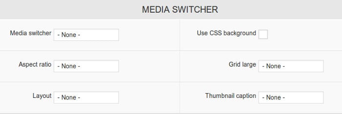
Media Switcher:
We can select appropriate media switching option like switching to content, link to smaller slick etc.
-
Use CSS Background:
Check this to turn the image into css background.
-
Aspect Ratio:
Select any aspect ratio for image slider.
-
Grid Large:
Set this option only for larger displays if needed.
-
Layout:
This option can be used for selecting a layout that specifies the slider and caption position etc.
-
Thumbnail Caption:
Here we can decide what should be displayed as thumbnail caption among alt and title text of the image.
-
Caption Fields:
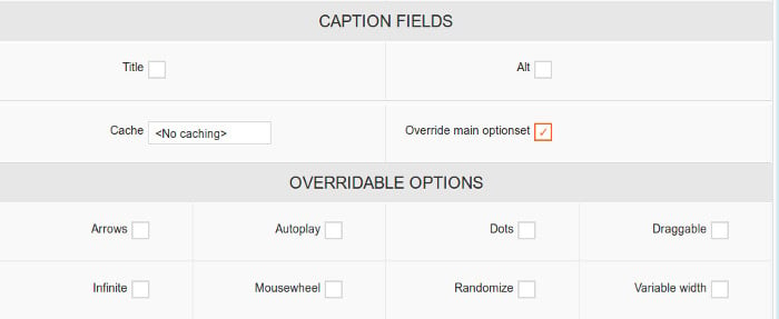
Here we can tick alt and title field for displaying as a caption for each slide.
-
Cache:
If we need to cache our slider data, then we can select an appropriate time period for caching data.
-
Override Main Optionset:
If we checked this, some settings of the selected option set can be overridden. The settings which can be overridden will be displayed after selecting this checkbox.
Over-ridable options are:
- Arrows - check if slider next and previous arrow need to be displayed.
- Autoplay – check if the slider needs to be auto played.
- Dots – check if the slider bottom dots needs to be displayed.
- Draggable – makes the slider draggable.
- Infinite – allow the slider slide infinitely.
- Mousewheel – allow the slider to slide when mouse scrolls.
- Randomize – for random sliding.
- Variable width – select if each slide needs to be displayed as variable width.
-
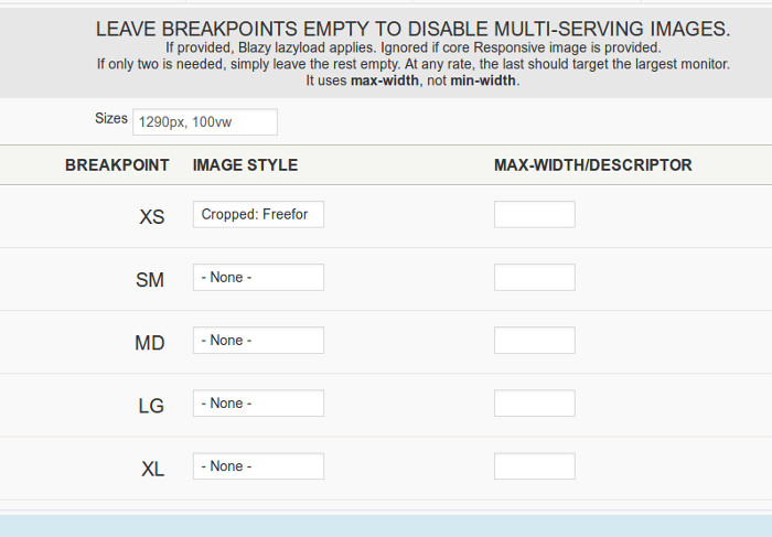
Settings for Responsiveness:
Leave Breakpoints empty to disable multi-serving images. If provided, lazyload applies. This is ignored if core responsive image is provided. It uses max-width, not min-width. Here we can set breakpoints as we needed.
The above listed are fields of slick configuration. This configuration is enough for creating a slider. If we need to customize more then we can create an option set and use it. Option set increases the re-usability of configurations. Now let's discuss how to create a new option set.
Creating Option Set
Go to the configuration page, under media, select slick. On this page, we can see the default options set. This cannot be edited, but we can create its duplicate and edit. Here we can configure our slider from the basic, like slider arrows, autoplay, dots, variable width or height, etc.
Click on duplicate and give a name to the options set. There are two tabs one is settings and the other is a responsive display. Settings tab for specifying the needed configuration for the slider and responsive display tab for specifying the responsive design.
Now we are going to discuss the fields in the option set.
-
Optimized:
Check to optimize the stored options. Anything similar to defaults will not be stored, except those required by sub-modules and theme_slick().
-
Breakpoints:
Here we can specify the number of breakpoints which is needed for the responsive design. After adding the number of breakpoints, we can specify configuration for each breakpoint in ‘responsive display’ tab.
-
Skin:
Here we can select a skin for this particular option set.
-
Mobile First:
This is used for specifying mobile first responsive display (taking min-width instead of max-width).
-
asNavFor Target:
Can specify ID or class for navigation to other sliders.
-
Accessibility:
Enables tabbing and arrow key navigation.
There are many fields for specifying variable height or width, autoplay, dots for the slider, next and previous icons, slide speed, fade draggable infinite loop of slides, etc..
After creating slick configurations, print the field for displaying the slick slider. Slick is an easy way to create a slider with large options for customization.
Read 'How to create Slider using Slick View in Drupal'