How to test responsive theming?
First of all let us see what is responsive theme testing. Responsive theming is nothing but just testing and ensuring whether the website layout, images and its functionalities are working on different mobile versions as it is working on your desktop. In short we can say that responsive theming is ensuring the flexibility of a website on mobiles. Here are the steps involved for responsive theme testing which you can refer while testing the same.
Here are the two common situations we encounter while testing responsive theme. First one is when we test the website on different mobiles. The second scenario arises when we don’t have the device/mobile phones mentioned by the client. No need to worry, we have an alternative method. We can test responsive theming in our local machine itself. For this you need to follow certain simple steps which are given below:
This process starts with the installation of Drupal on your local machine. If you need assistance for installation of drupal you can refer- http://www.zyxware.com/services/drupal-solutions/installing-configuring…
- Download and install Drupal 7.
- You can obtain the theme from the concerned developer. Just paste the theme folders into sites/all/themes.
- Open the Drupal in your browser and go to Appearance. There you can see the themes which you have currently pasted. Set it as default.
- Also you can see Adaptive core theme . Please enable it. Then only the theme will be adaptive.
- Save the settings. Then close the Appearance window. You are done with enabling the Theme.
- Now you can add contents/blocks and you can maintain the site.
Now, how can we test responsive theming in local system?
Here is the solution.
In Mozilla we can adjust the browser width to the device/mobile width (according to our requirement). For this there is an add-on called "Responsive design view". You only need to download and enable the same. After enabling it, go to the Tools menu >> choose Web Developer >> under that select Responsive Design View.
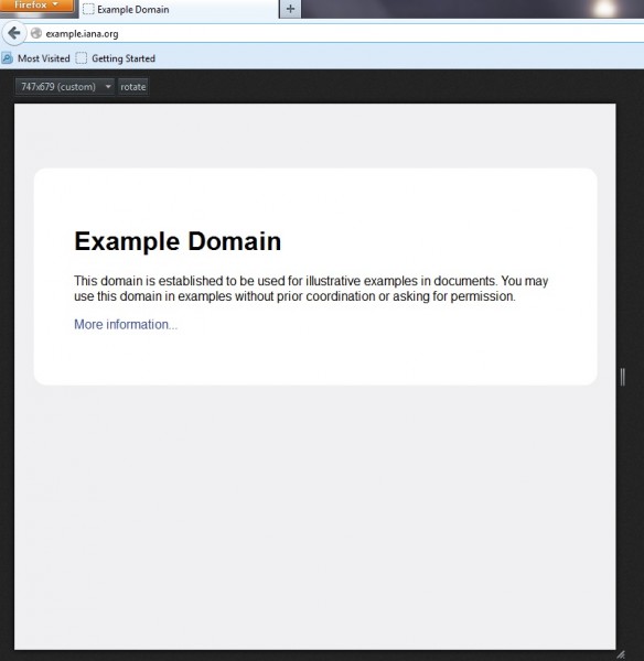
The Responsive Design View tool comes with a number of preset sizes for mobile, web or tablet resolutions. Here there is also an option for users to adjust the resolution, by drag-selecting the area from the bottom right corner.
Now you can test on different break points depending on Client's requirement. When the browser width or device width reaches to any of these widths the corresponding style sheets will be loaded. Here ensure that the different mobile phones supports the website design.
For example, here is the width setting that I tested in one of my project. It may help you understand better. This is a responsive theme with 5 breakpoints.
- Desktop version (769px to 960px width and above)
- Landscape tablet version (641px to 768px)
- Portrait tablet version (481px to 640px )
- Landscape mobile version. (321px (Portrait mode) and 480px(Landscape mode))
- Portrait mobile version. (Maximum width 320px)
With the advancement of technology, mobile phones and tablets are replacing the traditional desktops. Keeping this in view, we testers should be able to ensure the quality of the websites on mobile phones and tablets. Only then, our testing would become complete in every aspect. Hope this article helps. Feel free to share your views.