Ensuring Website Accessibility: Popular Tools for Color Contrast Testing
When designing a website, it is crucial to ensure it is accessible to all users, including those with disabilities. One important aspect of website accessibility is color contrast analysis, which ensures that text and background colors have sufficient contrast ratios to make the content readable for people with low vision or color blindness. This article will explore the importance of color contrast analysis in website accessibility testing and provide examples of popular color contrast testing and analyzer tools.
Why Color Contrast Analysis is Important in Website Accessibility Testing
Color contrast analysis is essential in website accessibility testing for the following reasons:
- It ensures that the content is readable: Without sufficient contrast between the text and background colors, users with low vision or color blindness may struggle to read the content on your website. This can make it difficult for them to access important information, impacting their user experience and even preventing them from using your website altogether.
- It helps you comply with accessibility guidelines: The Web Content Accessibility Guidelines (WCAG) 2.1 provide guidelines for color contrast ratios to ensure that websites are accessible to all users. By conducting color contrast analysis, you can ensure that your website meets these guidelines and is accessible to people with disabilities.
- It promotes inclusivity: Web accessibility ensures that everyone can access and use your website regardless of their abilities. By conducting color contrast analysis, you make your website more inclusive and accessible to all users.
Popular Color Contrast Testing and Analyzer Tools
Contrast Checker by WebAIM
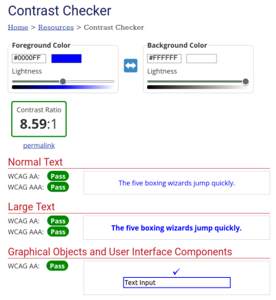
Contrast Checker by WebAIM is a free online tool that allows users to check the contrast ratio by entering the hexadecimal codes of the text and background colors. It evaluates the contrast ratio based on WCAG guidelines and provides a pass/fail result with detailed information on the contrast ratio, brightness, and color difference.
CCA - Colour Contrast Analyzer
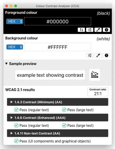
CCA is a free, open-source tool provided by the Paciello Group that calculates the contrast between two colors. It can be used to assess the contrast of text against its background or any contrast levels between two colors. CCA offers advanced features such as the ability to analyze the contrast of images, assess contrast of non-text user interface elements, and save test results in a report format.
Accessibility Insights for Web
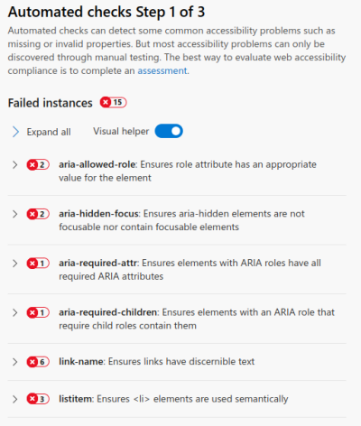
Accessibility Insights for Web is a free, open-source tool developed by Microsoft that includes a color contrast analyzer. It allows users to analyze the color contrast of web pages against WCAG guidelines and provides a detailed report with improvement recommendations.
Tanaguru Contrast-Finder
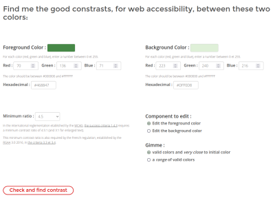
Tanaguru Contrast-Finder is a tool that assists users in finding color combinations that offer optimal contrast for visually impaired readers. It adheres to the Web Content Accessibility Guidelines (WCAG) standards and suggests the best combination of foreground and background colors for maximum accessibility.
Lighthouse
Lighthouse is an open-source tool developed by Google that audits the performance, accessibility, and best practices of web pages. It includes a color contrast analyzer that evaluates the contrast ratio of text against its background and provides recommendations for improvements based on WCAG guidelines.
How do you automate the color contrast checks?
Lighthouse is available as a chrome plugin. This allows you to execute accessibility tests, including color contrast checks.
Here are the steps to install the Lighthouse plugin in Chrome:
- Open Chrome browser and go to the Chrome Web Store.
- Search for "Lighthouse" in the search bar.
- Select the Lighthouse plugin from the search results.
- Click the "Add to Chrome" button.
- A pop-up will appear. Click the "Add extension" button to install the plugin.
- Once installed, the Lighthouse plugin will be available in the Chrome browser's Developer Tools.
To run a color contrast test using Lighthouse, follow these steps:
- Open the web page you want to test in the Chrome browser.
- Right-click anywhere on the page and select "Inspect" from the drop-down menu.
- In the Developer Tools panel that appears, click on the "Lighthouse" tab.
- Click on the "Generate report" button to run the audit.
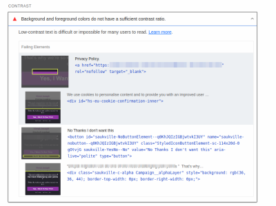
- Once the audit is complete, scroll down to the "Accessibility" section of the report.
- Under "Contrast," the report will display the number of elements with insufficient contrast and those with contrast issues.
- Click on "View details" to see a list of the elements with contrast issues and their respective contrast ratios.
- Make any necessary adjustments to improve the contrast ratios and run the audit again to verify that the contrast issues have been resolved.
Conclusion
Web accessibility is crucial in providing equal access to everyone, regardless of their abilities. Color contrast is a crucial factor to consider when designing a website, as it ensures that individuals with visual impairments can easily read the content. The Color Contrast Testing and Analyser tools can help developers ensure that their website meets the WCAG 2.1 requirements for color contrast, making the website more accessible and usable for all. By prioritizing web accessibility and color contrast, we can create a more inclusive and user-friendly digital environment for everyone.